CART: Classification AND Regression Trees
Introduction
The goal of the Decision Tree Regression Algorithm is to split your data into groups. The algorithm uses something called information entropy, which is a mathematical process. The point of the algorithm is to split the data in such a way that information is added in the form of groupings. It stops splitting the data when it’s unable to add any more information to the dataset.
For example, given a scatter plot with two Independent Variables and with ‘y’ being in the third dimension like seen below, we can see how by splitting the data into groups we have a clearer picture of what’s going on.
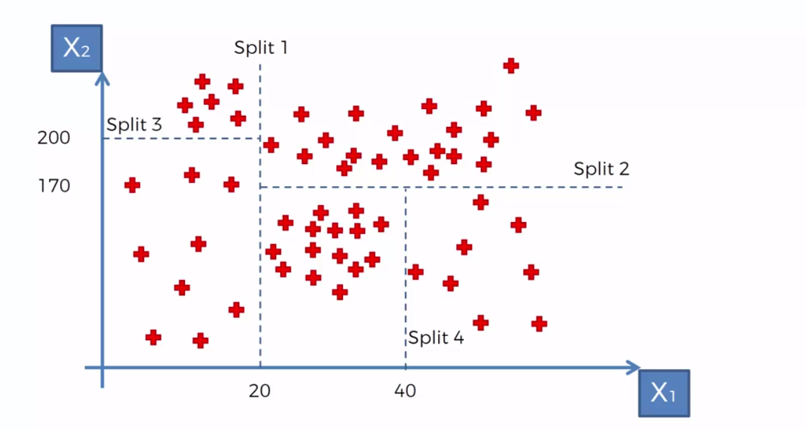
Each split is called a leaf and the final leaves are called terminal leaves.
So, let’s say we add a new point and (where = 30 and = 150) In order to predict the ‘y’ value we take the average of all the values with the terminal leaf and that value will be assigned to our new point.
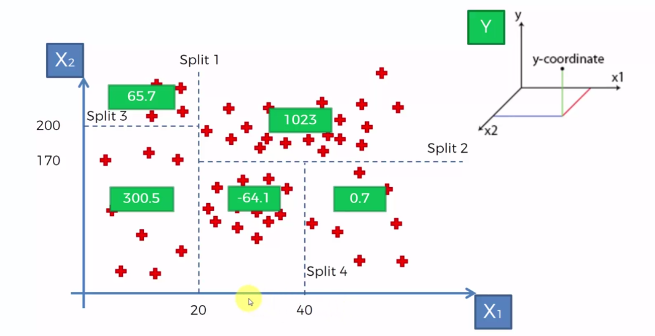
So, here in this case the green boxes represent the average of the terminal leaf. If we take P(30, 150), our prediction for ‘y’ is -64.1.
Another way to visualize the dataset is like this.
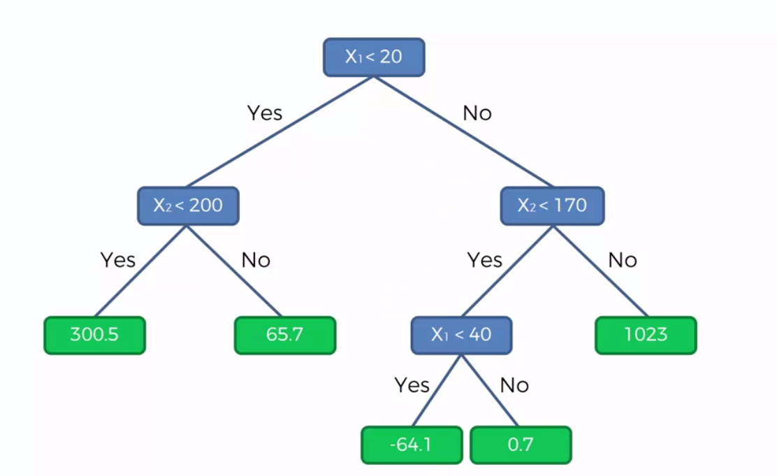
Here, we simply follow the tree. So in the case of P(30, 150), < 20 false. < 170 is true. < 40 is true. So the prediction will be again -64.1.
Building Decision Tree Regression
Use the Regression Template to preprocess the data.
Creating the Regressor
Import the DecisionTreeRegressor class from the library sklearn.tree and create an object of the class.
DecisionTreeRegressor takes the arguments:
random_state: to get the same result use the same number for random_state
from sklearn.tree import DecisionTreeRegressor
regressor = DecisionTreeRegressor(random_state = 0)
regressor.fit(X, y)
Visualize the dataset
The problem is that we need to make sure the resolution is higher using the template. This is because a Decision Tree is not a continous function but instead a step wise function.
#HIGH RESOLUTION AND SMOOTHER CURVE
X_grid = np.arrange(min(X), max(X), 0.01)
X_grid = X_grid.reshape((len(X_grid), 1))
plt.scatter(X, y, color='red')
plt.plot(X_grid, regressor.predict(X_grid), color = 'blue')
plt.title('Title of my Model)
plt.xlabel('X Axis Title')
plt.ylabel('Y Axis Title')
plt.show()