Introduction
Logistic Regression helps deal with predicting datasets that are more categorical. For example we wouldn’t be able to use something like linear regression on a data set like this:
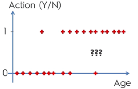
To get a better understanding of the graph we’ll need to do some math. What we can do is use linear regression and set it equal to a sigmoid function. This will give us a logistic regression. What’s important to understand with logistic regrssion is that the goal is not to predict ‘y’ but rather to get the probability of ‘y’
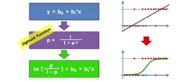
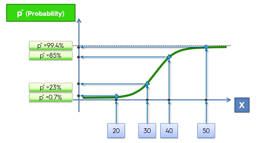
This new line of best fit will give the ability to predict the probabilty. So here on the ‘y’ axis is will go from 0 to 1 representing the probabilty of an event occuring given ‘X’ as seen below.
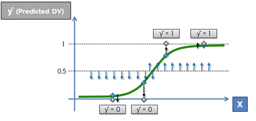
If however, instead of probabilty we wanted a prediction instead, we can still achieve this. To do this, we select a line arbitrally. Typically we choose 0.5 or 50%. If the probabilty of the event occuring is below 50% we can say that the prediction of this event will not occur (therefore will be 0) and vice versa.
Building Logistic Regression in Python
Use regression template to setup the dataset and make sure to apply Feature Scaling.
The next step is to import the LogisticRegression class from the sklearn.linear_model library.
Then just create an object and fit it to the training set so the classifier can learn the correlation between X_train and Y_train
from sklearn.linear_model import LogisticRegression
classifier = LogisticRegression(random_state = 0)
classifier.fit(X_train, y_train)
Then we can predict the result with the predict() method and use the X_test dataset as an argument to make a prediction on those values
y_pred = classifier.predict(X_test)
Creating a Confusion Matrix, which is a matrix that will contain the correct predictions that our model made on the test set as well as the inncorrect predictions.
Import from the sklearn.matrix library import the confusion_matrix function
and compute it by passing the parameters y and y_pred so that the matrix can find the real values vs the predicted values
from sklearn.metrics import confusion_matrix
cm = confusion_matrix(y_test, y_pred)
Visualizing the Training set and Test set
First import the ListedColormap from matplotlib.colors library. Create to new variables called X_set and y_set and set them equal to the X_train or X_test and y_train or y_test.
from matplotlib.colors import ListedColormap
X_set, y_set = X_train, y_train
Prepare he grid so that we can color ever pixel in the frame. We start by taking the minimum age of the age values (minus 1 so the points aren’t touchng the axis) and we stop at the max age of the set in order to get the range of our frame. We do the same for the y axis (salary in this example) and we make to set a step argument to choose the resolution.
X1, X2 = np.meshgrid(np.arrange(start= X_set[:, 0].min - 1, stop = X_set[:, 0].max() + 1, step = 0.01),
                    np.arrange(start= X_set[:, 1].min - 1, stop = X_set[:, 1].max() + 1, step = 0.01))
We can use the contour function to generate a line of best fit that will be definend by our prediction model. And we also need to plot the limits of x and y.
plt.contour(X1, X2, classifier.predict(np.array([X1.ravel(), X2.ravel()]).T.reshape(X1.shape), aplha = 0.75 cmap = ListedColormap(('red', 'green')))
plt.xlim(X1.min(), X1.max())
plt.xlim(X2.min(), X2.max())
To generate the scatter plot we loop through each value and assign a color depending on whether the value is 1 or 0
for i, j in enumerate(np.unique(y_set)):
    plt.scatter(X_set[y_set[y_set == j, 0], X_set[y_set == j, 1],
                c = ListedColormap(('red', 'green'))(i), label = j)
Lastly, generate graph components
plt.title('Logistic Regression (Test set)')
plt.xlabel('Age')
plt.ylabel('Estimated Salary')
plt.legend()
plt.show()
Visualisation Template
# Visualising the Training set results
from matplotlib.colors import ListedColormap
X_set, y_set = X_train, y_train
X1, X2 = np.meshgrid(np.arange(start = X_set[:, 0].min() - 1, stop = X_set[:, 0].max() + 1, step = 0.01),
                    np.arange(start = X_set[:, 1].min() - 1, stop = X_set[:, 1].max() + 1, step = 0.01))
plt.contourf(X1, X2, classifier.predict(np.array([X1.ravel(), X2.ravel()]).T).reshape(X1.shape),
            alpha = 0.75, cmap = ListedColormap(('red', 'green')))
plt.xlim(X1.min(), X1.max())
plt.ylim(X2.min(), X2.max())
for i, j in enumerate(np.unique(y_set)):
    plt.scatter(X_set[y_set == j, 0], X_set[y_set == j, 1],
                c = ListedColormap(('red', 'green'))(i), label = j)
plt.title('Logistic Regression (Training set)')
plt.xlabel('Age')
plt.ylabel('Estimated Salary')
plt.legend()
plt.show()

# Visualising the Test set results
from matplotlib.colors import ListedColormap
X_set, y_set = X_test, y_test
X1, X2 = np.meshgrid(np.arange(start = X_set[:, 0].min() - 1, stop = X_set[:, 0].max() + 1, step = 0.01),
                    np.arange(start = X_set[:, 1].min() - 1, stop = X_set[:, 1].max() + 1, step = 0.01))
plt.contourf(X1, X2, classifier.predict(np.array([X1.ravel(), X2.ravel()]).T).reshape(X1.shape),
            alpha = 0.75, cmap = ListedColormap(('red', 'green')))
plt.xlim(X1.min(), X1.max())
plt.ylim(X2.min(), X2.max())
for i, j in enumerate(np.unique(y_set)):
    plt.scatter(X_set[y_set == j, 0], X_set[y_set == j, 1],
                c = ListedColormap(('red', 'green'))(i), label = j)
plt.title('Logistic Regression (Test set)')
plt.xlabel('Age')
plt.ylabel('Estimated Salary')
plt.legend()
plt.show()